Four Seconds That Cost Me Two Hours
Four Seconds That Cost Me Two Hours
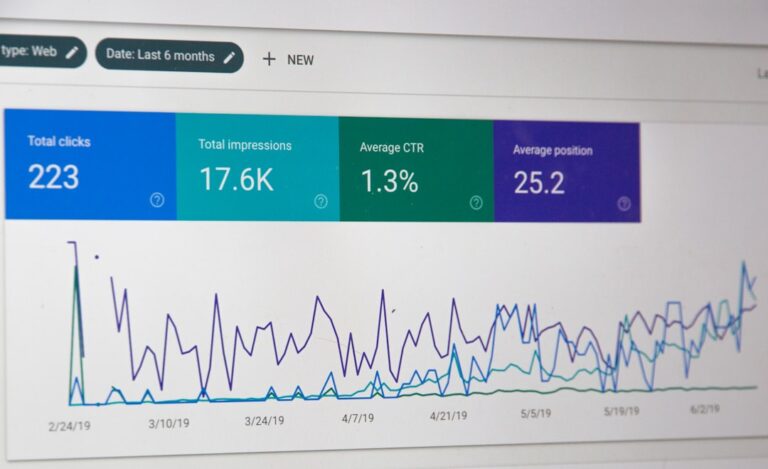
I was standing in a coffee shop in the Katong area of Singapore, waiting for my oat latte, when my phone buzzed. One of those Google PageSpeed Insights emails I’d set up months ago and forgotten about. The score for my little web hosting blog had dropped from 72 to 43. Mobile. Forty-three.
I knew exactly what had happened. The week before, I’d uploaded a set of screenshots from a recent trip to the Gardens by the Bay — high-res JPEGs, each one about 3MB, because I was too lazy to batch-resize. The email felt like a public shaming from a robot. I stood there scowling at my phone while the barista called my name twice.
That afternoon, I spent over two hours compressing, reformatting, and re-uploading images that should never have been that large in the first place. Two hours I could have spent writing or, you know, actually being outside in Singapore instead of hunched over a laptop in my own living room.
I haven’t made that mistake since. But it took one very specific, very avoidable screw-up to finally fix my image pipeline.
The Supertree Grove at 1.1MB
Before that PageSpeed blow-up, I’d heard about WebP. Everyone in web hosting circles talks about it. But I’d never actually bothered to convert anything. My thinking was: JPEG works fine, everyone can see it, why add a step?
The answer, as I discovered that afternoon, is size. A WebP file of the same visual quality as a JPEG is roughly 25 to 35 percent smaller. For a page with ten images, that’s not a minor improvement — it’s the difference between a page loading in three seconds and a page loading in six.
I tested this with one specific photo: the Supertree Grove at twilight, taken from the OCBC Skyway. The original JPEG was 4.2MB. Converted to WebP at 80% quality, it came out at 1.1MB. The difference in visual quality was basically undetectable on my monitor. I had to zoom in to 200% and pixel-peep to see any difference at all.
The conversion itself is trivial. I use a free tool called Squoosh — just drag a file in, slide the quality bar, and download the WebP. You can batch-convert with ImageMagick on the command line if you’re comfortable with that, but for most people, Squoosh is fine.
The catch, and there is one: not every browser supports WebP. Safari on older macOS versions doesn’t. Some older Android browsers don’t. So you can’t just swap every JPEG for a WebP and walk away. You need a fallback.
There are two ways to handle this. One is the <picture> element, which lets you specify multiple format sources and let the browser pick the one it supports. The other is using a plugin or server-side solution that detects the browser and serves the right format automatically. I went with the <picture> approach because it’s simpler and doesn’t require server configuration I don’t fully control.
It adds maybe four lines of HTML per image. Not nothing. But compared to re-uploading a dozen 3MB JPEGs because you forgot to resize them? I’ll take the extra four lines.
Let me be specific about what that PageSpeed drop cost me. Not in abstract “user experience” terms — in concrete, annoying, I-want-that-time-back terms.
The coffee shop latte was $6.50. By the time I finished recompressing those images, I’d missed an entire afternoon. I had to cancel a call with a friend who was visiting from Kuala Lumpur. I ate a sad microwave meal for dinner because I didn’t have time to cook. The whole day was thrown off by something that should have taken fifteen minutes at most.
That’s the real cost of skipping image optimization. It’s not just the bandwidth or the hosting bill. It’s the time you lose fixing something that you could have prevented with a single, simple step at the beginning.
Between Outram Park and HarbourFront
I used to think lazy loading was some kind of fancy JavaScript trick for people who cared too much about performance metrics. Then I loaded a page with twenty images on a 4G connection in an MRT tunnel between Outram Park and HarbourFront, and I changed my mind.
Lazy loading means images only load when they’re about to enter the viewport. Not when the page first loads. For a blog post with ten images, the difference is dramatic — the page becomes interactive in about a second instead of waiting for all ten images to download.
The native way to do this is absurdly simple. You add loading="lazy" to the <img> tag. That’s it. No JavaScript library, no plugin, no configuration. Just a single attribute. Browsers that support it will handle the rest.
I tested this on my own site using Chrome’s DevTools network tab. Without lazy loading, a post with twelve images took about 7.2 seconds to fully load on a simulated 3G connection. With lazy loading on the same twelve images, the time to interactive dropped to 2.8 seconds. The images that were below the fold didn’t even start loading until I scrolled down.
There’s one thing to watch out for: don’t lazy-load the very first image on the page, especially if it’s a hero image or the main visual. That image is above the fold and should load immediately. Lazy loading it just adds unnecessary delay. I lazy-load everything from the second image onward.
I also set explicit width and height attributes on every image. This prevents layout shift — that annoying thing where text jumps down the page as images load. The loading="lazy" attribute plus explicit dimensions means the page renders cleanly even before images arrive.
A few months ago, I was helping a friend with his small e-commerce site. He sold handmade leather goods from a workshop in Chinatown. His product pages had about thirty images each — different angles, close-ups of stitching, that kind of thing. He wasn’t lazy loading anything.
I loaded one of his product pages on my phone while standing outside his workshop. It took eleven seconds to become usable. Eleven seconds. In Singapore, where everyone is on 5G and expects everything instantly.
He told me his bounce rate was around 68%. I told him to add loading="lazy" to every product image and make sure his thumbnails were WebP. Week later, he messaged me — bounce rate had dropped to 44%. Not a scientific experiment, but the correlation is hard to ignore.
Boat Quay with visible banding
Here’s the thing nobody tells you about image compression: you can absolutely ruin a photo by compressing it too aggressively. I know because I’ve done it.
There was a photo from an evening walk along the Singapore River. The light was hitting the shophouses in Boat Quay just right — warm orange on the pastel facades, the reflections rippling in the water. I compressed it down to about 180KB as a JPEG. When I looked at it on my phone later, the sky had visible banding. The reflections looked like someone had smudged them with a digital thumb.
The file was small. The image was ruined. I had to go back to the original and redo it at a higher quality setting.
The trick is finding the sweet spot where the file is small enough to load fast but the image still looks like itself. For most web use, I aim for a quality setting between 70 and 80. That usually produces a file that’s about 60-70% smaller than the original with no visible artifacts on typical screens.
For WebP, I go a bit lower — 70% quality on WebP is visually similar to 80% on JPEG, and the file size is significantly smaller. I always check the result on an actual mobile device before committing, because what looks fine on a 27-inch monitor often looks terrible on a 6-inch phone screen.
My current workflow, after all the trial and error, is boringly simple.
- I take photos with my phone — a Pixel 6a, nothing fancy. They come out at about 4-5MB each.
- I drop them into Squoosh. Convert to WebP at 75% quality. Downscale to 1920px on the longest side.
- I also save a JPEG version at 80% quality for fallback, same dimensions.
- I upload both formats. Use
<picture>with the WebP as the primary source, JPEG as fallback. - Every image except the first one gets
loading="lazy". - Every image gets explicit
widthandheightattributes.
That’s it. There’s no magic tool. No expensive plugin. It’s a sequence of five steps that takes about a minute per image. The difference in page load speed is enormous.
Scrolling without the jolt
After I fixed my own site, I ran Lighthouse again. Score went from 43 to 89. The missing points were mostly from third-party scripts — analytics, a Google Font, that kind of stuff — which I haven’t bothered to optimize because I’m not that obsessive.
What surprised me wasn’t the score. It was the actual feel of the site. Scrolling through my old posts used to feel sluggish — images would pop in, text would shift around, there was this constant low-grade friction. After the optimization, the site felt snappy. Not just “the numbers are better” snappy. Actually, physically, noticeable-snappy.
I spent two hours fixing something I should have done right the first time. And the result was a site that felt fundamentally different to use.
I still think about that afternoon in Katong. The latte was good. The PageSpeed email was not. But the fix itself was simple. WebP, lazy loading, sensible compression. Three things. Fifteen minutes of setup. You don’t need a course or a consultant or a fancy tool. You just need to actually do it.
📷 Photos: Ferenc Almasi (Unsplash), Shekai (Unsplash)