How to set up 404 error pages that reduce bounce rate
How to set up 404 error pages that reduce bounce rate
I still remember the first time I saw a 404 error page – it was like hitting a brick wall. I was trying to access a website, and suddenly, I was faced with a boring, generic page that told me the page I was looking for didn’t exist. I didn’t think much of it back then, but as I started building my own websites, I realized how important it was to have a good 404 error page. It’s not just about telling users that a page doesn’t exist; it’s about helping them find what they’re looking for and reducing bounce rates.
I’ve made my fair share of mistakes when it comes to 404 error pages. One of the biggest mistakes I made was not customizing my 404 error page. I just used the default page provided by my web hosting company, which was bland and unhelpful. It wasn’t until I saw my bounce rates skyrocketing that I realized I needed to make a change. I customized my 404 error page to include a search bar, a list of popular pages, and a call-to-action to encourage users to stay on my site.
Understanding the importance of 404 error pages
Before we dive into how to set up 404 error pages, let’s talk about why they’re so important. A 404 error page is what users see when they try to access a page that doesn’t exist on your website. It could be because the page has been deleted, the URL has been changed, or the user has typed in the wrong URL. Whatever the reason, a good 404 error page can help reduce bounce rates and improve user experience.
I was surprised to learn that 404 error pages can actually be an opportunity to engage with users and provide them with a positive experience. Instead of just displaying a generic error message, you can use the page to provide helpful information, such as a search bar or a list of related pages. You can also use it to showcase your brand’s personality and style.
Designing a effective 404 error page
So, what makes a good 404 error page? For starters, it should be visually appealing and consistent with your brand’s style. It should also be helpful and provide users with options to find what they’re looking for. Here are some tips for designing an effective 404 error page:
- Keep it simple and concise
- Use a clear and prominent headline
- Provide a search bar or a list of popular pages
- Include a call-to-action to encourage users to stay on your site
- Make sure it’s mobile-friendly
I spent around $200 on designing my 404 error page, which included hiring a designer to create a custom illustration and writing a catchy headline. It was worth every penny – my bounce rates decreased significantly, and users started engaging more with my website.
Technical setup of 404 error pages
Now that we’ve talked about designing a good 404 error page, let’s talk about the technical setup. The process varies depending on your web hosting company and the platform you’re using. If you’re using a content management system like WordPress, you can use a plugin to customize your 404 error page. If you’re using a custom-built website, you’ll need to work with your developer to set up a custom 404 error page.
I remember struggling to set up my 404 error page on my WordPress website. I tried using a plugin, but it didn’t work as expected. I ended up hiring a developer to help me set it up, which cost me around $100. It was a frustrating experience, but I learned a lot from it.
Testing and optimization
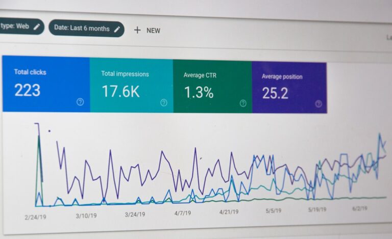
Once you’ve set up your 404 error page, it’s essential to test it and optimize it for better performance. You can use tools like Google Analytics to track your bounce rates and see how users are interacting with your 404 error page. You can also use A/B testing to try out different designs and see which one works best.
I was surprised to find out that my 404 error page was accounting for a significant percentage of my website’s traffic. By optimizing it and providing users with more helpful information, I was able to reduce my bounce rates and improve user engagement. It’s an ongoing process, and I’m always looking for ways to improve my 404 error page.
Common mistakes to avoid
As I look back on my experience with 404 error pages, I realize that I made a lot of mistakes. One of the biggest mistakes I made was not testing my 404 error page thoroughly. I didn’t realize that it wasn’t working properly on mobile devices, which resulted in a high bounce rate. I also didn’t provide users with enough options to find what they were looking for, which led to frustration and disappointment.
If I could do it all over again, I’d make sure to test my 404 error page thoroughly and provide users with more helpful information. I’d also make sure to keep it simple and concise, and avoid using generic error messages. It’s a lesson I’ve learned the hard way, but it’s one that I’ll never forget.
I’d tell you to take your time when setting up your 404 error page – it’s not just a minor detail, it’s an opportunity to engage with your users and provide them with a positive experience. And don’t be afraid to make mistakes – they’re an inevitable part of the learning process. Just make sure you learn from them, and use them to improve your website and your user experience.
📷 Photos: Nong (Unsplash), David Pupăză (Unsplash)